Here, we share eight design principles we have curated through years of building our PortX suite of integration products including Payment Manager, Partner Manager, and Integration Manager. These user-focused solutions scale IT teams and simplify connections to modern payment systems and applications.
At ModusBox, we build software that readies financial institutions to keep pace with technology’s rapidly increasing rate of change. To accomplish this, our product design must empower organizations to escape vendor dependencies and become more nimble by enabling both business and technical users alike. By combining industry best practices, trial and error, and customer feedback, we have developed eight design principles for developing “coding-optional” software. These principles are our North Star in product design, but they continue to evolve and improve, as is the case with everything we do.
First, what does “coding-optional design” mean?
Coding-optional design maintains user access to the powerful code that software developers need to integrate highly customized applications, while simultaneously presenting self-service, visual solutions for business users to create integrations and configurations. This allows highly skilled workers to focus on the top priority initiatives while enabling junior-level and business resources to accomplish more tasks on their own.
Our 8 design principles
Understand the “why” behind the goal
It isn’t enough to just understand the goal of your users. You have to understand the “why” behind that goal. This allows you to look past the most obvious solution to one that solves the user’s real problem. However, to truly understand their “why” you must get to know your potential users. Yes, this means talking to them. Asking them questions. Listening to their answers. Learning about their everyday working experiences.
And, it isn’t enough to only discuss the problem that they currently face. Good software design requires you to decipher their experiences, which can be a complicated process. But if you take the time to understand correctly, it is well worth the effort and allows you to design industry-changing products.
While designing Integration Manager we were focused on a certain group of metrics and our users told us they wanted to see a plot of that data. However, by investigating the “why” behind their request, we discovered that they only needed to determine whether they were currently above or below a certain value. The product displays a simple checkmark or ‘X’ depending on the status instead of requiring the user to decipher the data themselves.
Remember the big picture
The most challenging aspect of technical design is maintaining a feel for how everything fits into the bigger picture. It is critically important never to lose context of the overall product and user experience. Unfortunately, it is far too easy to over-index on the most important feature today and forget how it fits into the larger product. As a result, this creates fractured products that don’t feel like a unified solution.
To avoid this, we define how the user arrives at the feature and where they need to go next. We call this the hour before and the hour after. By defining these, we better understand our customer’s true experiences on those pages. And, this provides the best experience possible to your customer.
There is a customer support section in Payment Manager to view all failed or fraudulent transactions. Originally, we designed a whole new page to enable this feature, only to discover during a demo that the customer already had the ability to replicate this feature through our filtering functionality on other screens. We removed the new screen and simplified the filters. Without demonstrating this screen to the customer within the context of the bigger picture, we would not have caught this silly mistake until after product development had built and released the product.
Additionally, understanding the bigger picture benefits the design process by creating efficiencies. By presenting a feature out of context, to both users and stakeholders, it is often challenging for them to experience what it’s like to use your product. They simply won’t see how it fits into the overall product. This results in false feedback and a disconnect between what the customer needs and what you’ve designed.
Make people say “no”
Designs make the best conversation starters. It’s tempting to gather all of the required information before actually designing anything. The problem is that people are busy, and stakeholders rarely know what they need until presented with something that gets their mind thinking. For most people, a blank canvas is a scary thing. As a designer, it is our job to ensure that the customer never has to look at one. Often, this results in a lot of rejected designs. This can feel like failure. It is this failure, however, that we harness and has proven to be the fastest route to success.
During the early development of Payment Manager, we were stuck. That is until our design team built an end-to-end mock of what it would look like to use the product. This was presented to stakeholders who immediately rejected every screen. Failure? No. It sparked the conversation that launched real solutions to the problems that we were trying to address. The ideas freed the team to create the great product Payment Manager is today.
Get into the weeds
Integration is at the core of ModusBox and is a highly technical process. The goal of our UX is to simplify this process as much as possible. To do so, our design team must first understand and accept why integration is a technical process. If our design team were to gloss over the more technical aspects, it would limit our ability to simplify the life of our users. At ModusBox, we make it a point to explore the technical details with our users and internal development team to understand what they are trying to accomplish and how they do it.
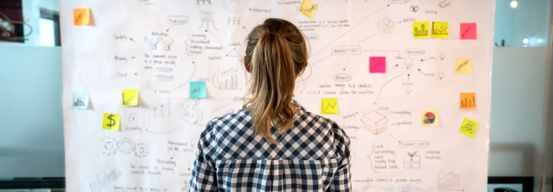
We end up drawing a lot of diagrams with boxes and lines that help us walk through different scenarios step by step. Talk about the APIs. Talk about the technical workflow. When you are sure you understand, only then should you begin to simplify the process and group things together. If you attempt to do this too early in the process, you will end up with an unusable solution missing key steps.
Our earliest Partner Manager design had a number of places where users gave feedback that our solution couldn’t solve for a technical edge-case. Why not? We had failed to truly get into the weeds with the user and understand their technical needs before designing a solution.
Be okay limiting your design
We are a relatively small design team in a small company. This limits our capacity to give every screen the love that it might deserve. It’s all about prioritization for us. This is a hard thing to do for designers. Our nature is to build something beautiful from start to finish. However, to keep up with the demand of our customers, prioritizing is critical. That is why it’s important for us to understand what the end use-case is for every single screen. We ask ourselves, “Is this a screen that only 1% of our users are going to see 1% of the time?” If the answer is “yes,” we have to be okay with giving it less attention than other higher priority screens – even if that means a sub-optimal design.
Be obvious, not slick or overwhelming
When a user lands on a screen for the first time, they should be able to quickly understand what options they have. If there are more advanced options that they need to interact with, these should be enabled through discovery and documentation. A user who wants to do advanced customization of a product is more willing to explore and experiment. However, a typical user can be overwhelmed by too many options and is less likely to return after feeling lost.
Always show the user information that is relevant to what is happening on screen. For example, we observed that users were frustrated when attempting to fill out forms in our Partner manager product. We learned that every field should automatically tell the user what they needed to enter – not just pop up an error if they got it wrong. Good UX doesn’t always equate to a beautiful UI; sometimes function needs to win over form. Be okay with that.
Make information easy to find and retain
Users shouldn’t need a map to find information in your application. Always include links or direct views to relevant information on screens that relate. Multiple pathways enable more users to be power-users and quickly complete their tasks. The human brain is not very good at holding a lot of information at the same time and users shouldn’t need to write information down on a piece of paper to figure things out. So, don’t make a user connect the dots in their head when you can help them do it on the screen. If you only provide a single path to find a piece of information, this will create a frustrating maze of clicking around. Links are free in a product. Add more of them to help users find what they are looking for.
This concept led to the creation of the Transaction Designer feature in our Partner Manager product. The feature fundamentally changed the product, turning what used to be a complicated process that included five separate screens, hundreds of clicks, and confusing directions into a simple process that you can complete on a single screen.
Enable collaboration
When we build products, our team considers collaboration between coworkers and how we can help them complete different tasks together. We do this in several ways such as providing direct links, allowing the user to save partially completed forms, and enabling comments, questions, and tags. In design, there is always something we can do to encourage and reinforce the power of collaboration. At some point, your users are going to show someone else what they are doing or working on. Enable that process in your design.
This is especially important in designing our visual transformation solution – a new tool that we are currently developing. Both developers and non-technical business users need to work together to build transformations with this low-code solution. A design with built-in tools for simplified collaboration will be essential for the success of this product.
Here’s to better software
So, there you have it. That’s a brief look at the core principles that shape our product design. Our hope is that by sharing these concepts, they help influence the creation of better software in our industry and others, and foster greater inclusion in the global economy.
We will go into more depth on these topics and how they influenced our products in future blog posts. In the meantime, if you have any thoughts or questions, feel free to post them below or contact our team today. We would love to hear from you.


